A New York Transit Themed App.
Made for Class.
This app started as a wild idea. I was obsessed with New York due to a recent trip, so I decided to make it the main stage player for one of my projects in the fall Semester 2025 of class. This was my first semester at Montreat college, so I wanted to go all out.
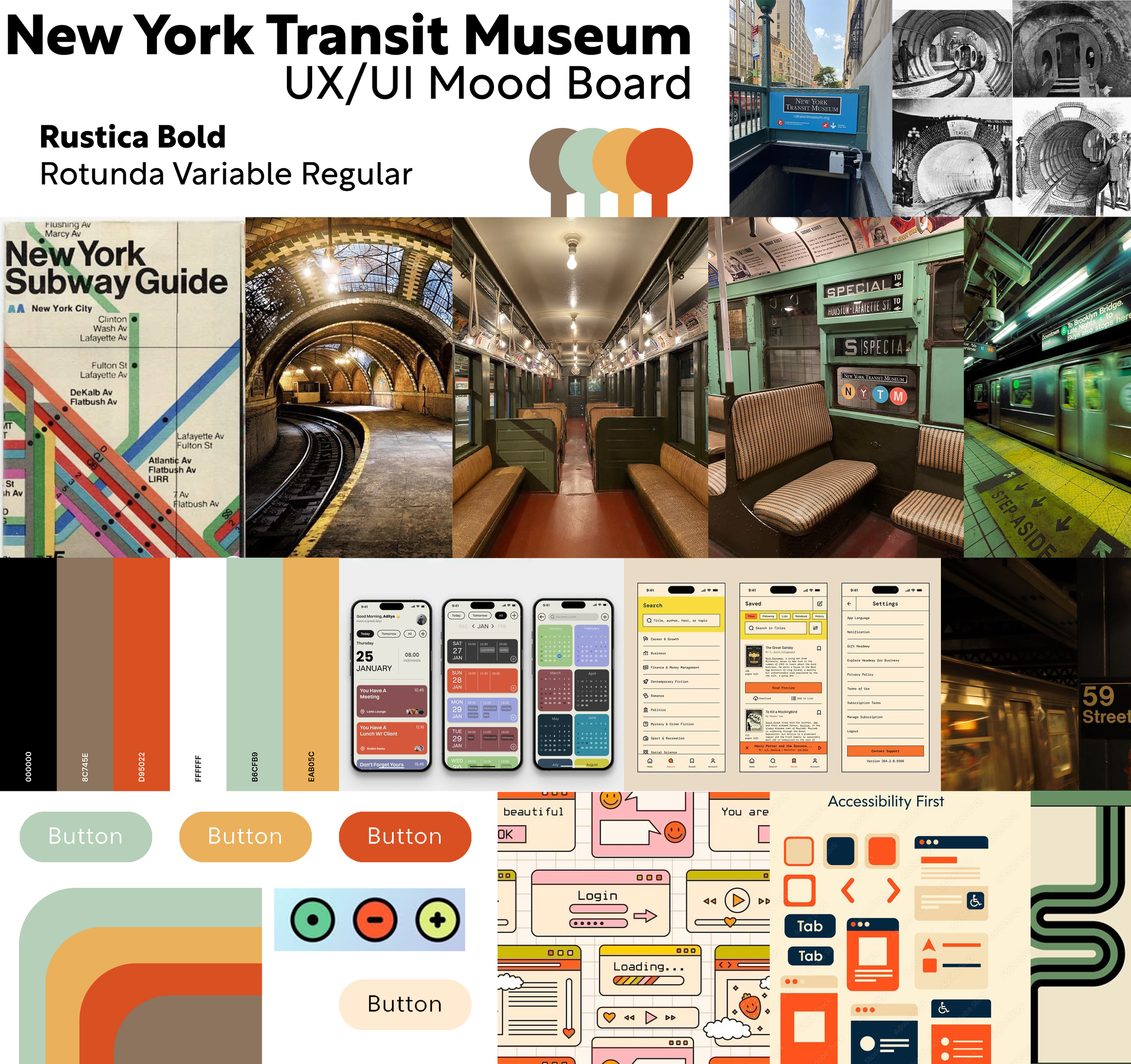
When I set out, the first thing on the agenda was the moodboard. Well, before that, I had to find a museum that was small and interesting. I looked around and found the New York Transit Museum. I felt that I could make something that felt like the subway and buses of the largest city in the United States. So I started on the mood board.
In the moodboard, I placed so many things about the New York subway that I loved. Not being from the city, I love how easy it is to use. While I have heard the complaints from the locals, it's still a marvel of engineering, and the design flow is too. Using the original design document as a starting point, I set out to make it different. Given its age, retro/faded colors were chosen, and the idea of using a Helvetica font really stuck with me since it's used all over the subway. I ended up with a rough text logo in the moodboard that heavily influenced the logo going forward.

I am still working on this page… So just check out the app for yourself!
My words can only do my work so much justice. Come back at a later date to see me ramble more about my process and the many many feedback loops I went through to get here!

